


Bulldogs Reveal Striking New Logo Embodying Pride and Determination
The Bulldogs have made an impactful change by unveiling a new club logo ahead of the 2026 season. This new design is particularly significant as it is the fifth logo in the club’s history.
Historical Context of Bulldogs Logos
The Bulldogs have a rich history with their logos, beginning with their first shield that was in use from 1935 to 1977. In 1978, they introduced a circular emblem that lasted until 1997. That year marked a shift to a modern image as the club prepared for the formation of the National Rugby League (NRL) in 1998. The logo underwent further changes before 2010, when the Bulldogs returned to their roots, including the re-establishment of the Canterbury-Bankstown prefix.
Introducing the New Logo
The newly revealed logo reflects the pride and determination inherent in the Bulldogs’ identity. CEO Aaron Warburton articulated the inspiration behind the redesign, emphasizing its significance. “This new emblem is more than just a logo – it reflects who we are, where we’ve come from, and where we’re going,” he noted.
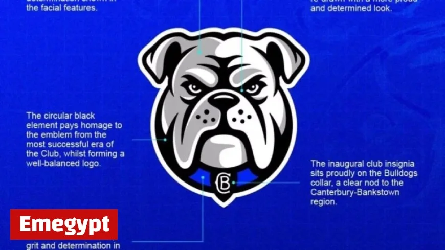
Key Elements of the Design
The new logo incorporates several key elements that embody the club’s spirit:
- The blue collar symbolizes the hardworking ethos of the Canterbury-Bankstown area.
- The original club insignia is featured on the collar, acknowledging historical roots.
- A circular black element pays tribute to the logo from the Bulldogs’ most successful period.
- Grey shading emphasizes the determination represented in the facial features of the logo.
- The facial depiction is characterized by a proud and determined expression.
Looking Ahead
The Bulldogs’ new logo captures the energy and ambition for the future while honoring a legacy that spans 90 years. This design not only connects the club to its storied past but also sets a bold direction for the years to come.